




MPCT
MPCT needed a brand that communicates credibility and care in equal measure, which is the balance almost every healthcare brand is trying to strike with the people it serves. Patients and stakeholders both need to feel that the organisation knows what it is doing, while never feeling like just another clinical, faceless institution.
The brief called for a professional, trustworthy identity that still feels human at the point of contact. Many healthcare brands lean so hard into looking serious and clinical that they end up feeling distant, and RGB wanted to steer clear of that pattern here. The aim was an identity a patient could trust immediately, and a partner organisation could stand behind with confidence.
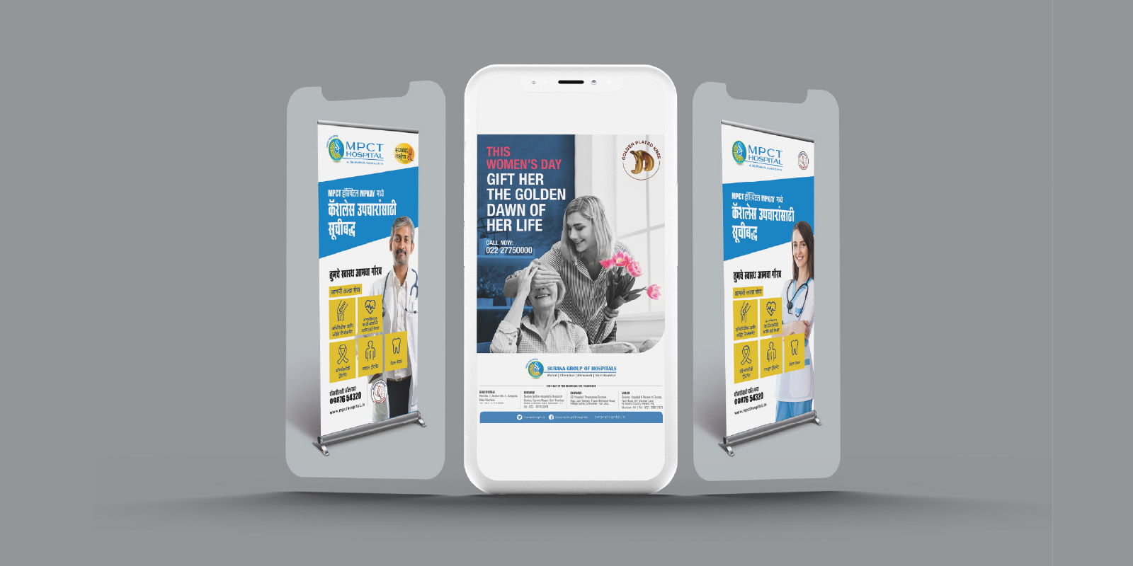
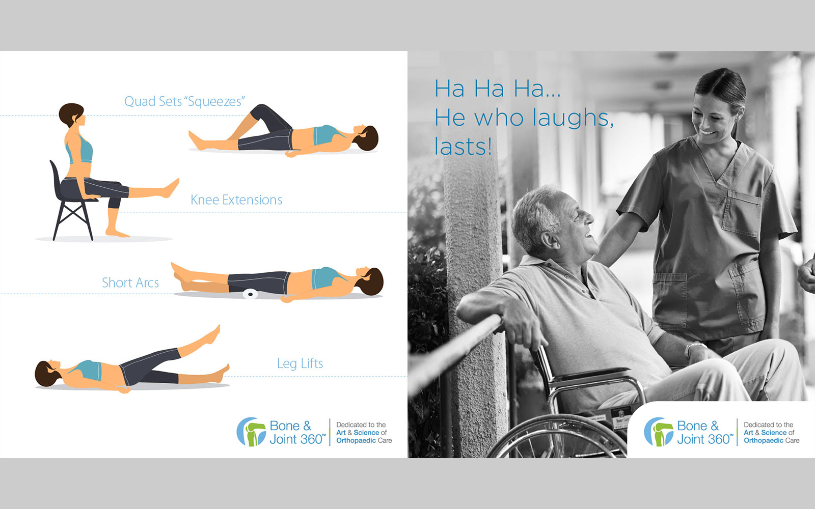
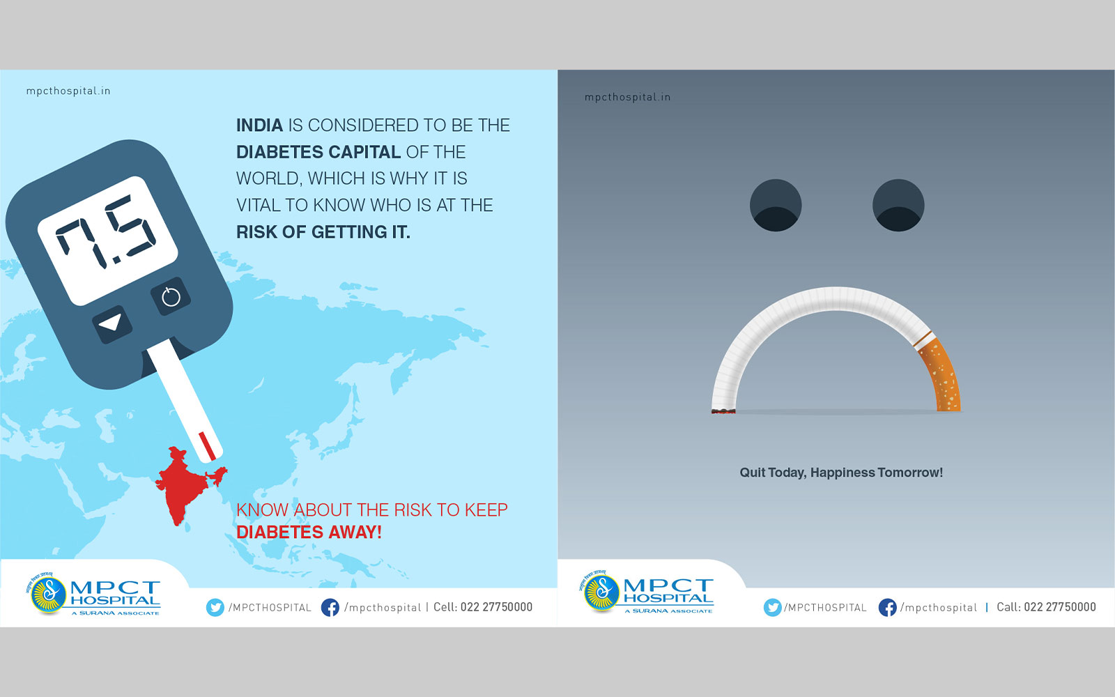
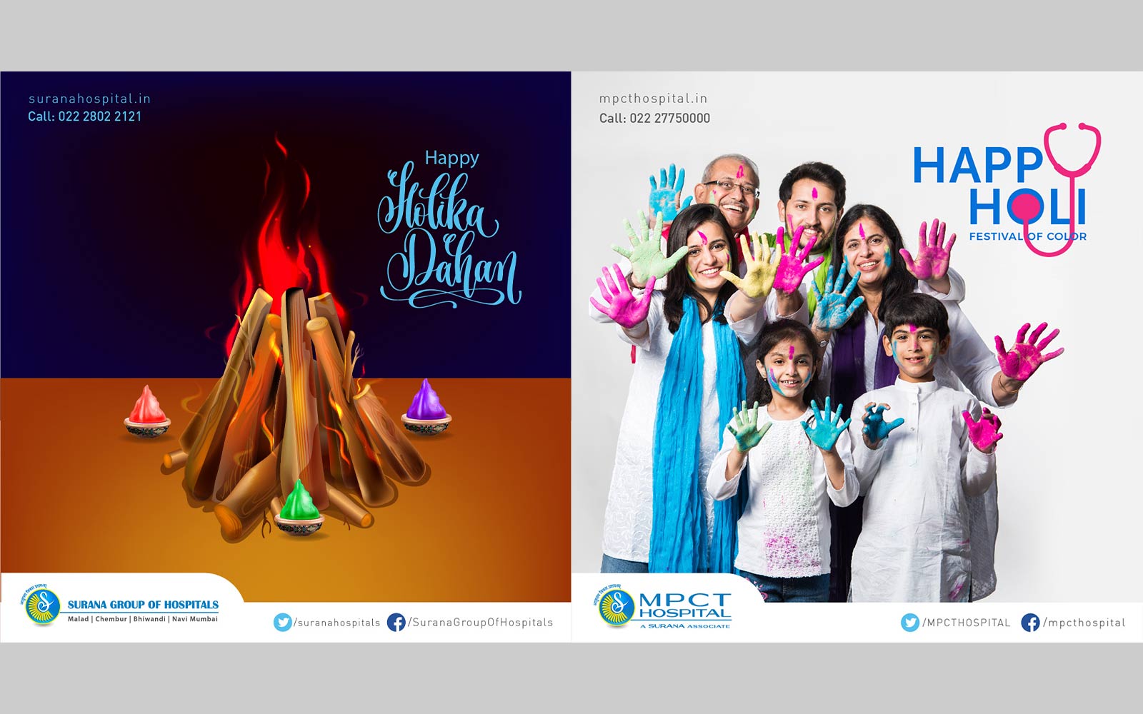
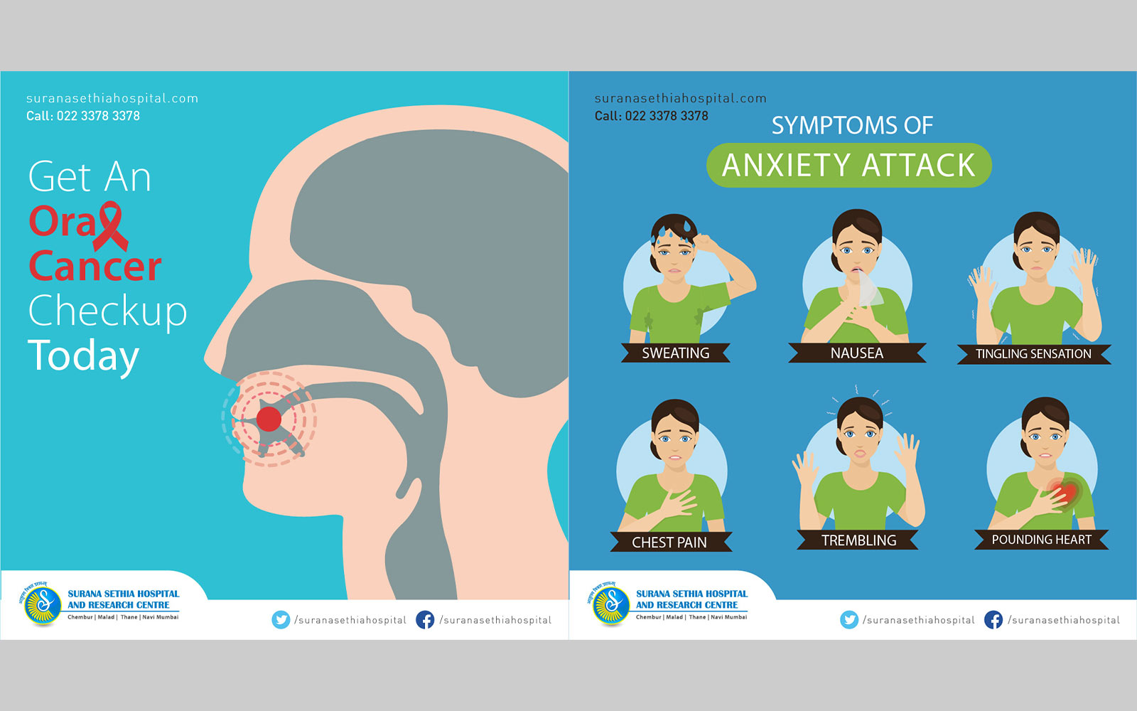
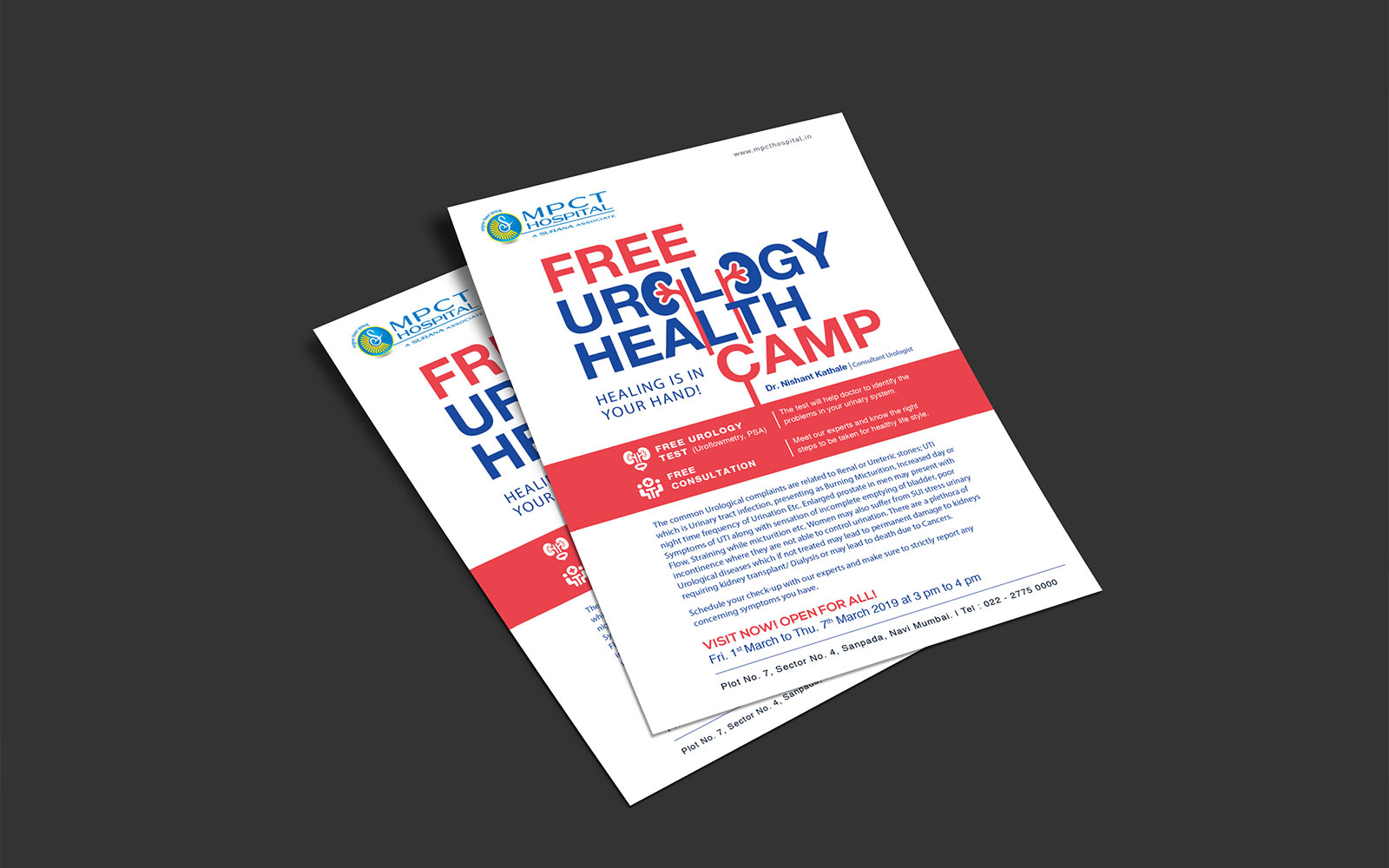
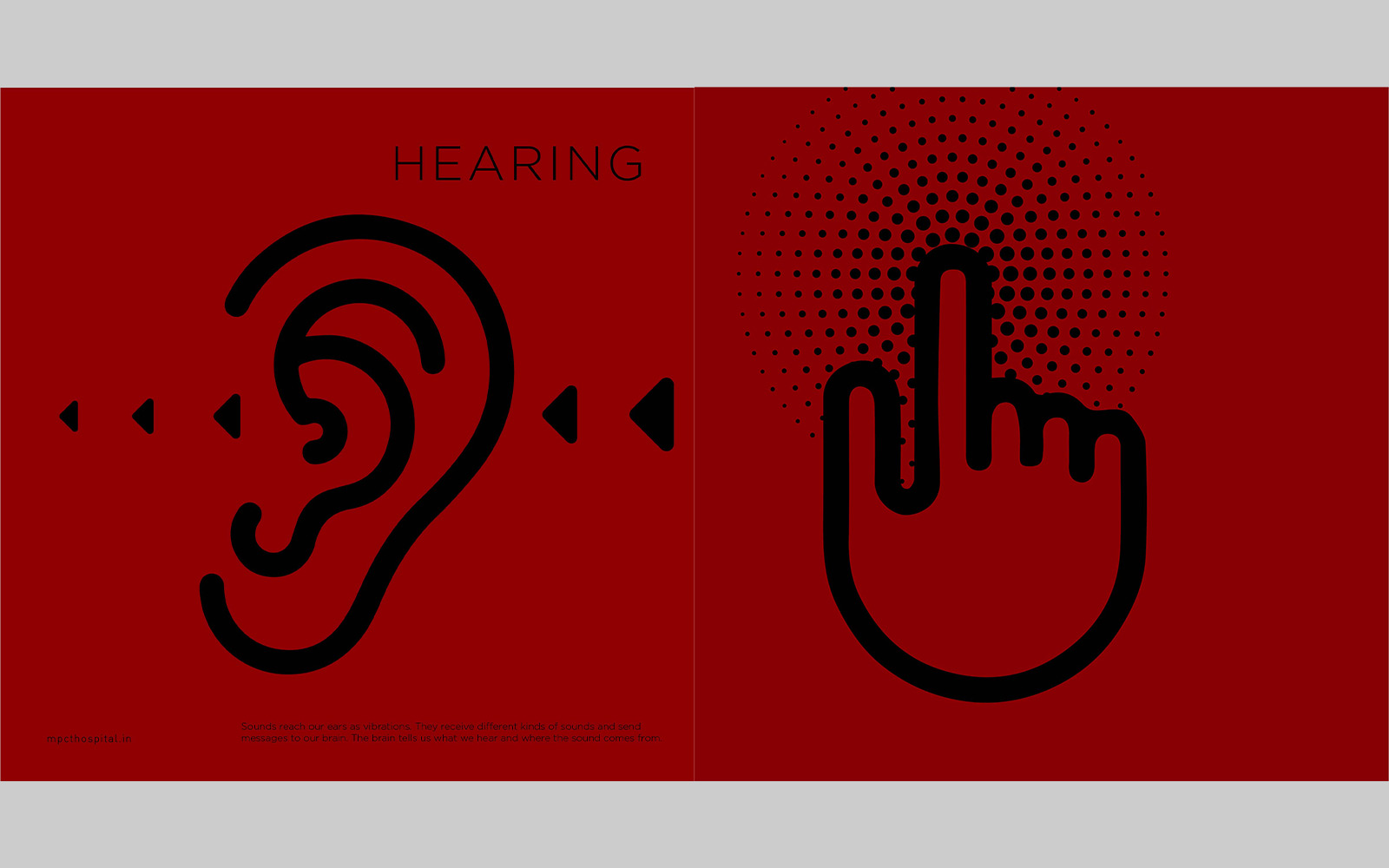
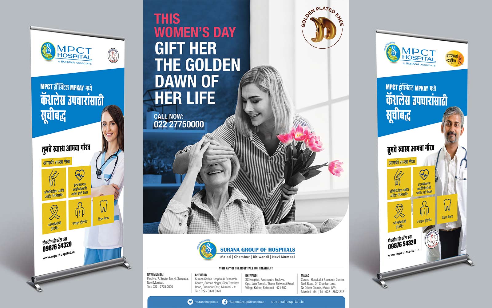
RGB developed a considered visual identity built around clear typography and a restrained colour palette. The overall tone was designed to read as competent without feeling cold, so that whether someone was looking at a brochure, a signboard or a website, the brand felt consistent and reassuring rather than clinical for the sake of it.
This identity was extended across brand collateral and digital touchpoints, giving MPCT a consistent, professional presence in every format it appears in, from print material to the organisation's online presence.