




My Lab
MYlab's brand identity was built around making diagnostics and lab science feel precise and modern, without feeling distant or overly technical to the people relying on it. A diagnostic brand lives or dies on trust, and that trust starts with how the brand looks and communicates before a single test result is ever delivered.
The brief asked for an identity that reflects scientific rigour while still feeling approachable to an everyday person waiting on a test result. That is a difficult line to walk. Lean too far into the clinical and the brand feels cold. Lean too far into the friendly and it risks feeling unserious for a category where accuracy matters this much.
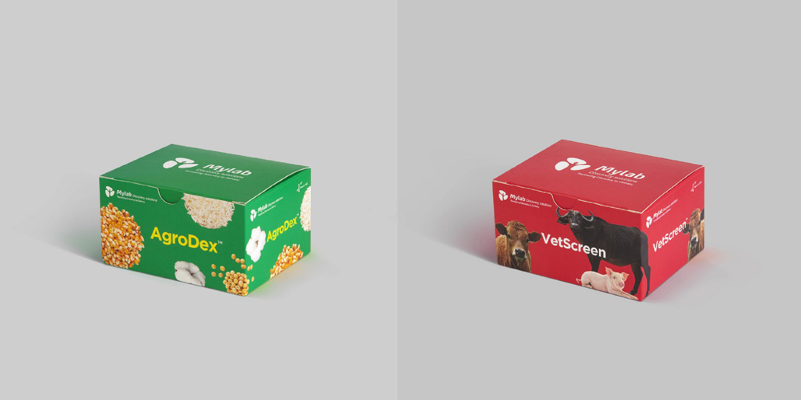
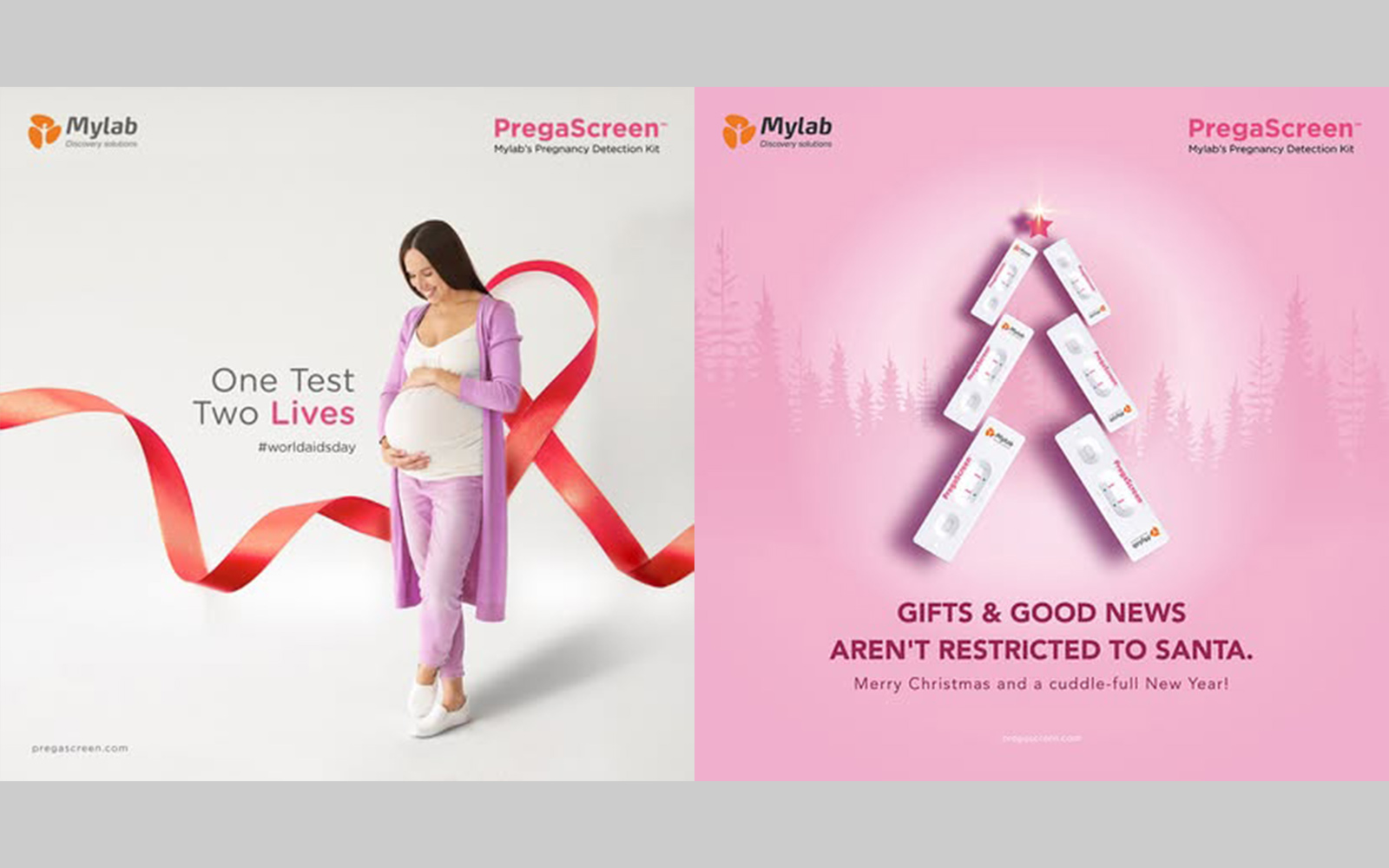
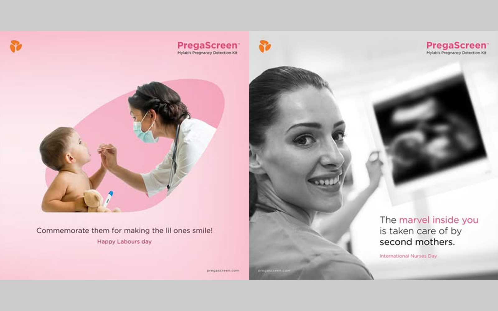
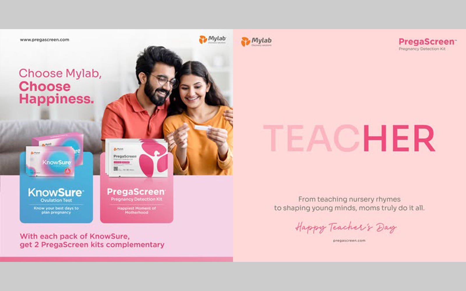
RGB's creative direction leaned into precision and clarity. Clean typography, a confident colour palette and visual cues throughout the system were all chosen to signal accuracy and reliability, while keeping the overall feel approachable rather than sterile.
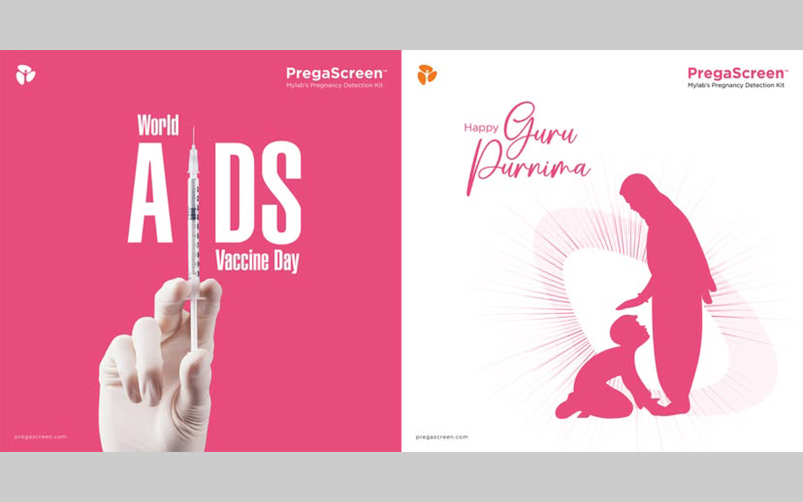
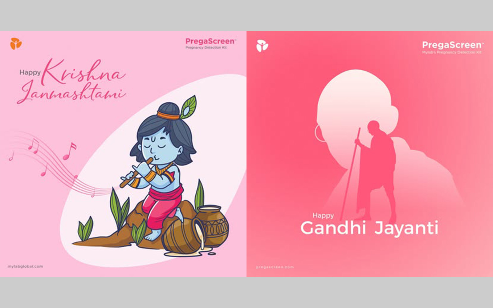
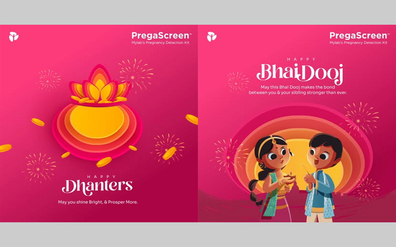
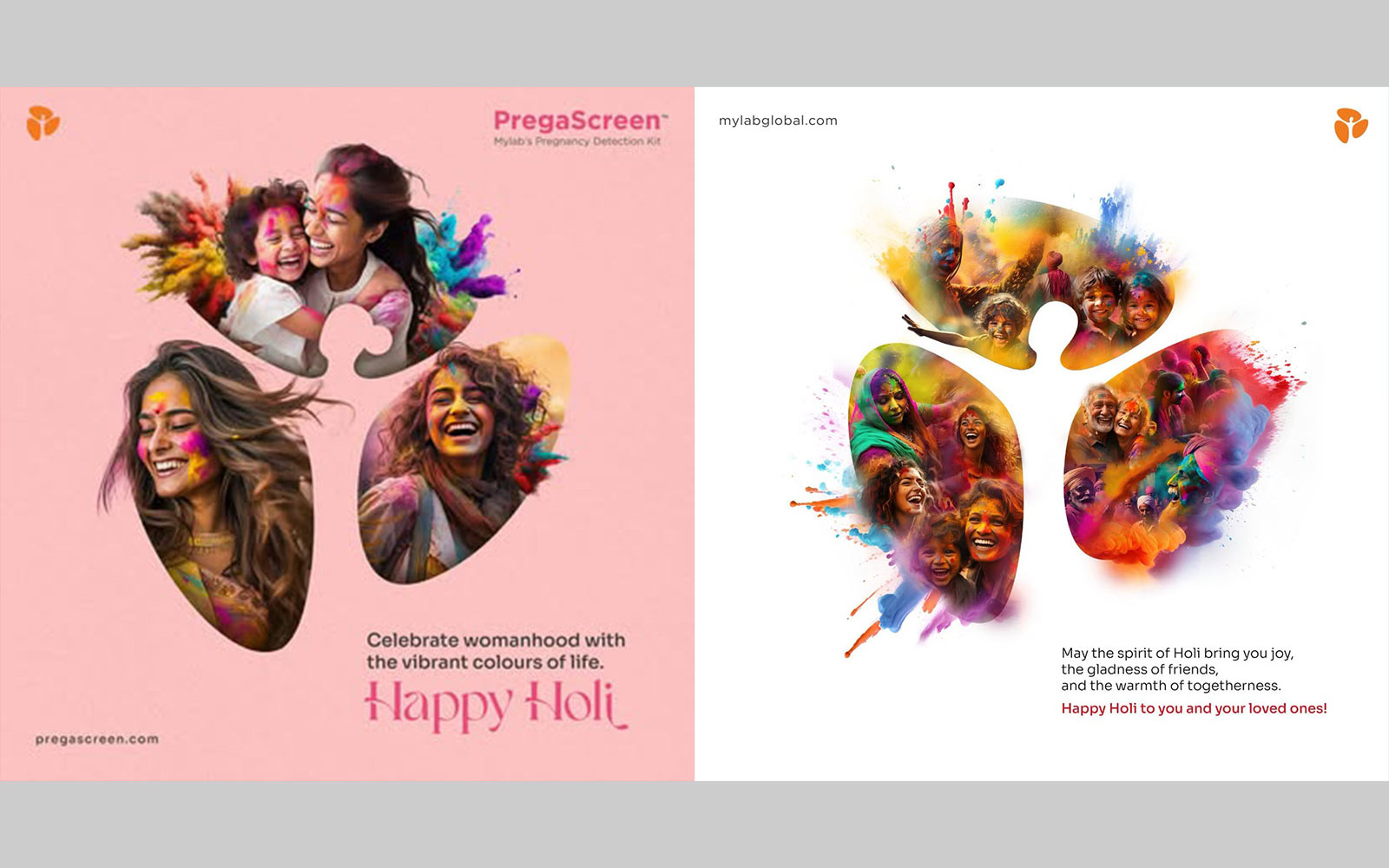
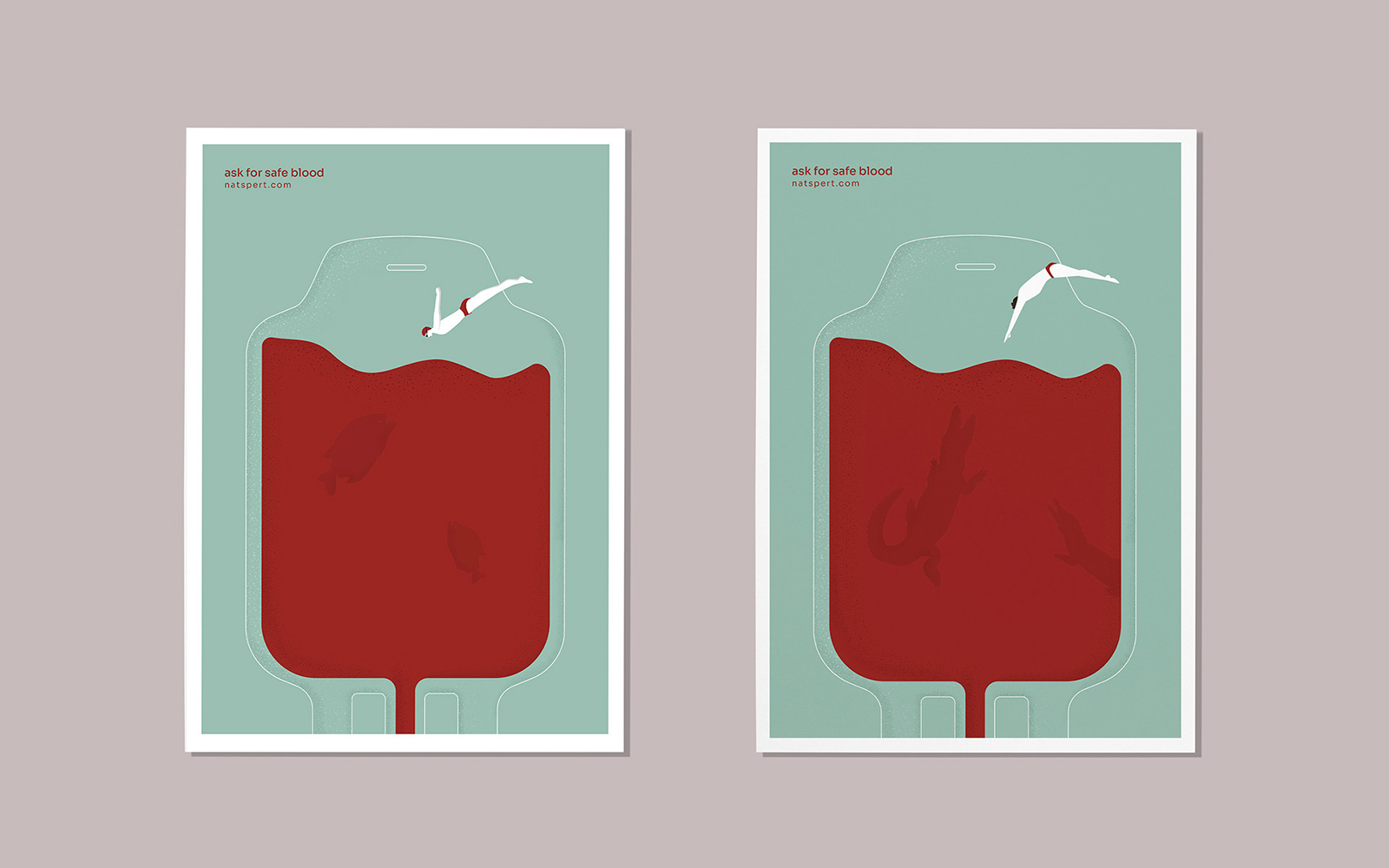
The identity was applied consistently across the brand's collateral and digital presence, reinforcing trust with every patient and partner touchpoint the brand shows up in.